How-to · Accessibility
How to fix low contrast text on a web page
The short answer
Sample the failing text and background in Contrast Checker's popup, then adjust lightness — darken the text or lighten the background — until the WCAG verdict flips: 4.5:1 for normal text, 3:1 for large text. Fix the shared CSS token, re-check the rendered page, and put a scrim behind text that sits on images.
- 1
Sample the failing text and its background with the popup's eyedropper to get the rendered colors.
- 2
Note the target: 4.5:1 for normal text, 3:1 for large text (WCAG AA).
- 3
Darken the text or lighten the background — adjust lightness, keep the hue.
- 4
Re-check the new pair in the popup and pass with some margin, not at exactly 4.5:1.
- 5
Apply the change to the design token or CSS variable, not just one element.
- 6
Reload and re-scan the page from the side panel to confirm nothing else regressed.
Low contrast text is one of the most common accessibility defects on the web — and one of the cheapest to fix, because the repair is almost always a lightness adjustment, not a redesign. Here is how to fix low contrast text once you've found it: which direction to move the colors, how far to go, and how to prove the fix on the live page. All the checking happens locally in Chrome with the free Contrast Checker extension.
Measure before you change anything
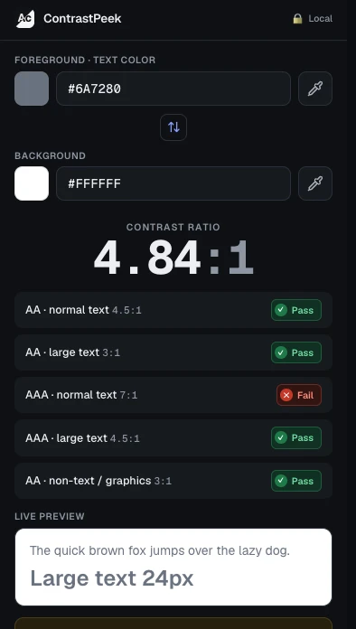
Open the popup and sample the failing text and its background with the eyedropper — you want the colors the browser actually painted, not the ones you remember from the style guide. The popup shows the ratio and grades it against WCAG AA and AAA at once. Your AA targets: 4.5:1 for normal text, 3:1 for large text (24px regular, or about 18.7px bold). If you haven't located the failures yet, scan the whole page from the side panel first and work from that list.
Move lightness, not hue
Contrast is computed from relative luminance, so lightness does nearly all the work. A gray-on-white pair failing at 3.8:1 is fixed by darkening the gray; swapping it for an equally light blue changes almost nothing. Keep the hue your brand wants and move lightness until the verdict flips — darken the text, lighten the background, or both a little. Re-check each candidate in the popup before it lands in your CSS.
Pass with a margin, and fix the token
Don't stop at exactly 4.5:1. Leave headroom so a hover state, a slightly different monitor or a future background tweak doesn't drop you back under the line. And make the change where the color is defined — the design token or CSS variable — rather than on one element. The same too-light gray is usually reused in captions, hints and secondary labels, so one token fix clears many failures at once.
Text over images and gradients
Text on a photo or gradient has no single background color, and Contrast Checker will tell you so: those cases are marked unmeasurable rather than given a made-up ratio. The reliable fix is to put a solid or near-solid scrim behind the text and check the text against the scrim color. If you keep the bare image, sample its lightest and darkest points and make the text pass against both.
Prove it on the rendered page
After the CSS change ships, re-sample the pair on the live page — themes, opacity and inheritance sometimes render something other than what the stylesheet promised. A quick re-scan from the side panel confirms nothing else regressed. Everything stays local: the extension reads a tab only when you invoke it (activeTab), with no account and no tracking.